Flexible Visual Systems and the SRB
Will Mclean on building the new SRB website
Designer and developer Will McLean guides readers through the principles and process behind the SRB’s new digital platform. From FVS to CMS, McLean decodes the acronyms, showing how the website is a bellwether for web development in the age of AI.
In 2022 the SRB embarked on its most ambitious technical project yet: to rebuild its digital platform from the ground up. Thanks to support from Create NSW, we were able to bring on board the team at Public Websites to re-envisage the way that we showcased the diverse facets of our program, from our print and digital publication streams to our public events. We wanted a faster, more accessible website that kept pace with the experimental inclinations of our contributors, and that carved out unexpected pathways through our open-access archive for our ever-expanding readership, both in Australia and abroad. We wanted a robust and flexible platform that maintained the SRB’s position at the forefront of digital publishing and an increasingly multi-medial critical culture. And now we have it.
The SRB’s new website is the fruit of over eighteen months of close consultation with designers and developers about everything from the typeface to the menu layout to the CMS. We’ve asked Will McLean, Director of Public Websites, to give some insight into this uniquely streamlined process and to explain some of the new features that mark this next chapter of the journal’s digital evolution.
I was introduced to the Sydney Review of Books in 2020 by my friend, and wonderful Sydney-based designer, Pat Armstrong. He approached me to help with the development of a new website under the guidance of then editor, Catriona Menzies-Pike.
Four years later, my studio, Public Websites, was given the opportunity again by the journal. Pat Kalucy, Managing & Creative Director at Public Websites, and I are pleased to launch the new site after months of thoughtful and diligent work by the SRB and Public Websites teams.
I want to take this opportunity on the day of the launch to draw your attention to one key aspect of the site: the generative tiles making up its unique look and feel. By doing this, I hope that you can see the thought and care that have been put into this project by the entire team and get a fresh insight into system design, a design process we think will have a large impact on our industry.
Image Problem
For our original 2020 brief, Pat Armstong and I developed a system to help the SRB team when they did not have a high-quality image for an essay. This was the first time I had delivered what I then called ‘generative design’ to a commercial client. Many of the sites I worked on at the time would look less than perfect when a client couldn’t consistently find or create the high-quality visuals for every article that the designer had used in their mock-ups. Designers love to see this as a lack of effort or knowledge on the client’s part, but of course it is not. It is a lack of resource, and this is something a designer has a responsibility to solve.
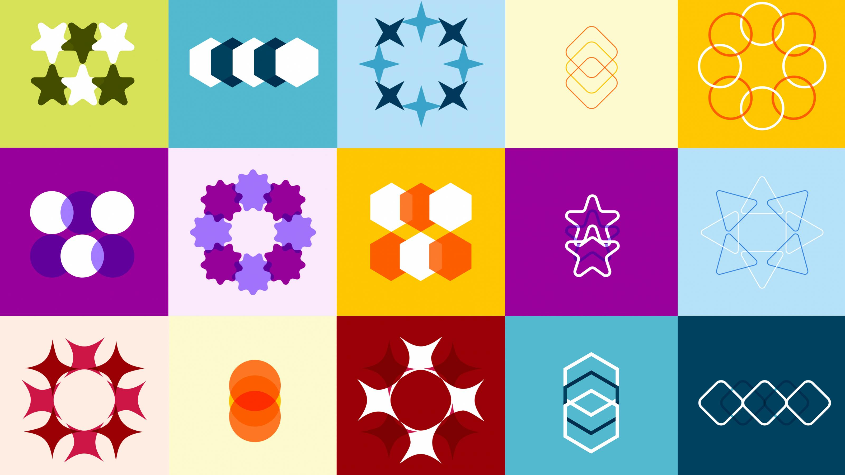
For that original brief we created a very simple system with only a few elements. The system had five lists of options: we needed to choose one layout, one shape, one colour pair, one background configuration, and one outline style. Those choices were then combined to create an image.
These choices could be combined to create thousands of unique configurations. If we had six options for each list of options, we could create 7,776 unique images! This more than covered all the essays in the archive.
It was very exciting to design, and what I have discovered in the intervening four years is that what we were creating could in fact be called a Flexible Visual System.
Flexible Visual Systems
In his book Flexible Visual Systems: The Design Manual for Contemporary Visual Identities (2021), Dr Martin Lorenz describes how designers can stop thinking about design as something crafted meticulously by the designer for a single output, and instead use design frameworks that emphasise adaptability and modularity. He calls these Flexible Visual Systems.
Each system starts with a component. These components can be assembled in various ways dictated by the designer to produce assets. The assets can then be deployed in multiple applications.
The system we developed for Sydney Review of Books in 2020 was precisely this. Our shapes, layouts, and so on were our components, our generated image was our asset, and our applications were the single cards or hero images in which the image appeared.
More brand for your buck
The success of this kind of system can be seen in the unintended consequences of those efficiency-driven decisions we made back in 2020. Since then, the patterns created in the generated images have snuck in the back-door and become the primary characteristic of the SRB’s branding. They were a fluid, highly recognisable, unique identity. We thought we were creating a preview card image; we had actually created a brand system. The SRB team were able to use the images across their social media and other outputs.
And now the brand system needed updating. Whenever a designer suggests a brand update, they usually mean money – a lot of money. Another fabulous side-effect of the systemisation of branding is that we can perform the update in an economical way without resorting to the usual cost-cutting measures on a project.
Something old, something new
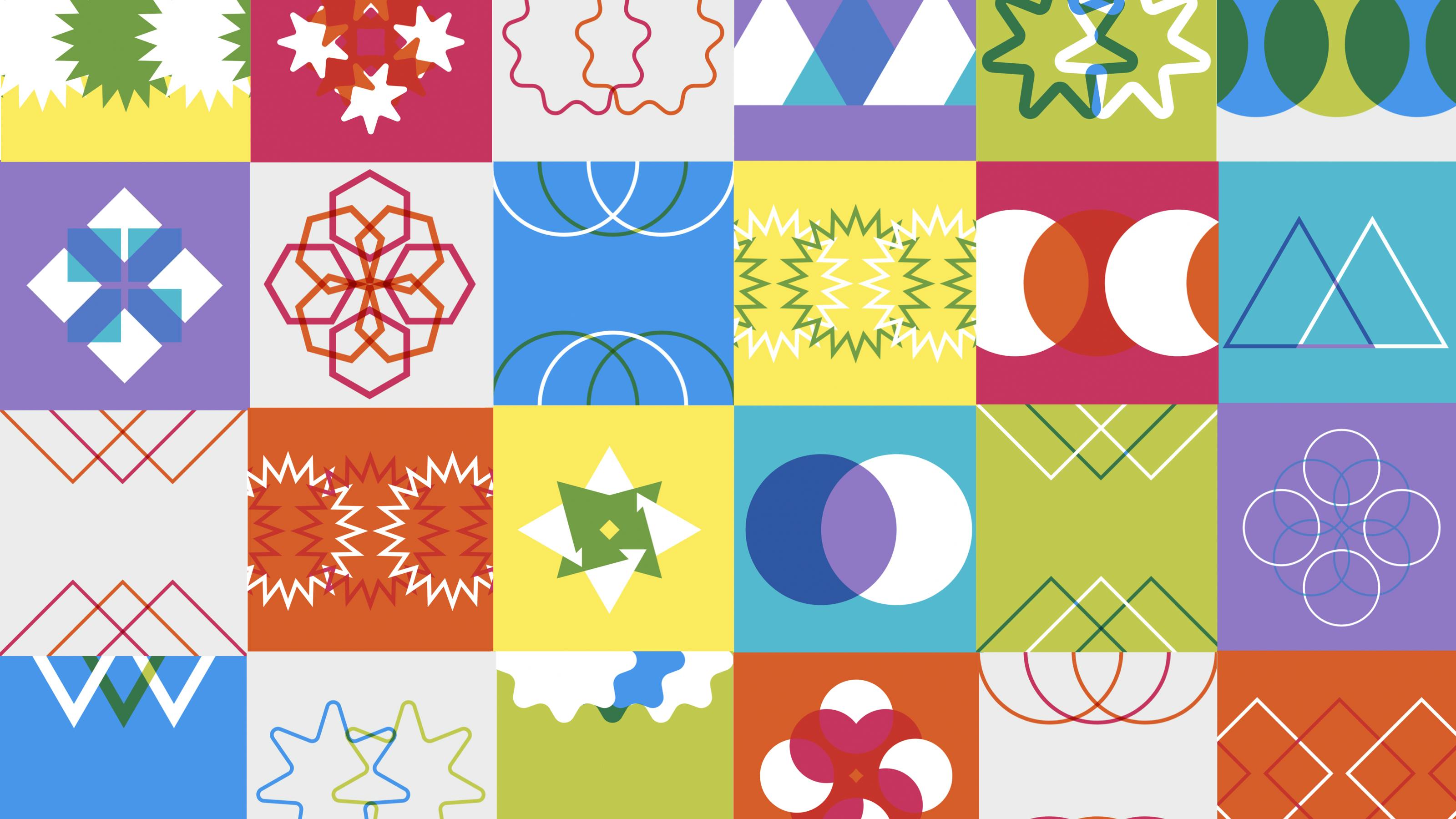
For the new brand we made some small adjustments to existing components and introduced some new ones. The system itself didn’t change at all, but adjusting some of the components refreshed the entire look. This was carefully considered and involved building a tool, but it had a structure and guidelines that meant it comprised only a small part of the budget.
Yet despite representing a small part of the budget, it was responsible for a large part of the redesign’s feeling of newness. The new colour palette created a fresh and contemporary look. The new shapes and layouts gave the SRB team options that built upon the old system rather than needing to be started from scratch.
KISS
‘Keep it simple, stupid’ is a very popular programming catch-cry. Simple code can be worked on by anyone, has fewer bugs, and works well for longer. We take the same approach to designing systems. We believe that a system need not be complex to be effective. In fact, the more complex it is, the more difficult it is to maintain, and the harder it is to collaborate with others on the design.
In this system we stayed simple. Shapes are simple. They are easy for everyone to understand. Five layouts are simple. We can all understand three shapes in a row, or eight shapes in a circle pattern. The same can be said for all the other variations. The magic happens when we begin to combine them: the simple system reveals itself to be sophisticated.
The fact that SRB readers can decipher the system if they want to is a beautiful thing. It helps people connect with the brand and remember the design principles.
What on earth is a modulus operator?
There is one element that could be described as drifting into the complex. The system can generate thousands of unique images. But we need it to pick one unique image for each essay. We could have allowed the SRB team to pick options for each essay. But that would involve making individual choices for an archive of over a thousand essays.
It would also lead to bias: each member of the team might have their favourite component for each option. Helen might love the circle and the purple colour. No matter how hard she tried to make sure she used other components, she would always end up using more of the circle and the colour purple. This would affect the tone of the overall site.
We needed something random, but we couldn’t have it randomly generate an image pattern every time the page loaded (meaning a different image each time you viewed an essay). We needed some way to pick random options from each variation, but have it linked to that article.
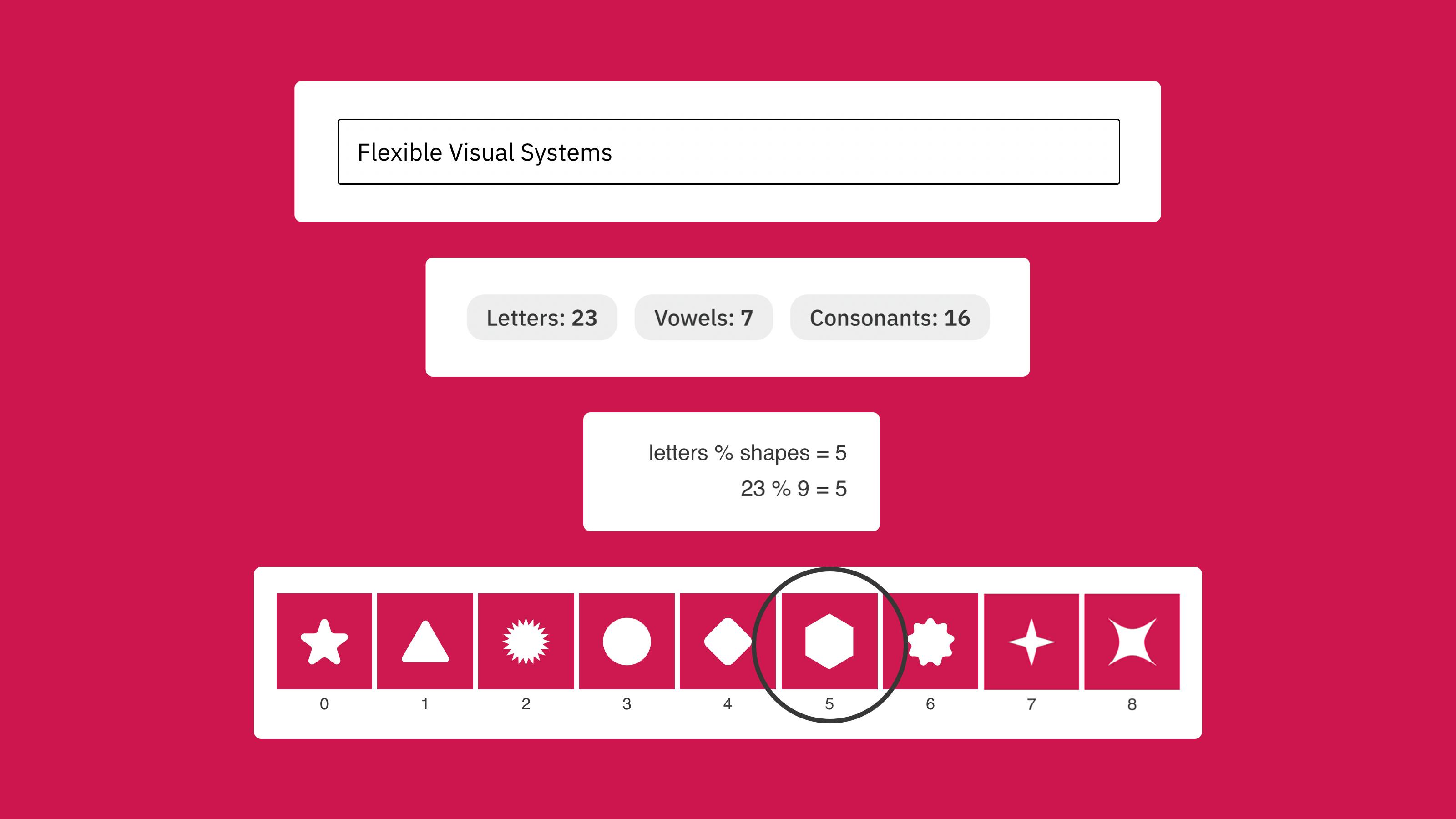
We decided that we should use the title of each essay. We know that each article has a unique title. We could count the letters making up that title and map that to an option for each component. But it was totally possible to get titles with the same character count. So we needed to use other parameters: vowels and consonants. This meant that each title had three numbers allocated to it. This made it highly unlikely that two different titles would have the same set of numbers associated with it and therefore generate the same pattern.
Now what to do with the three numbers!? This is where it does get a bit complex.
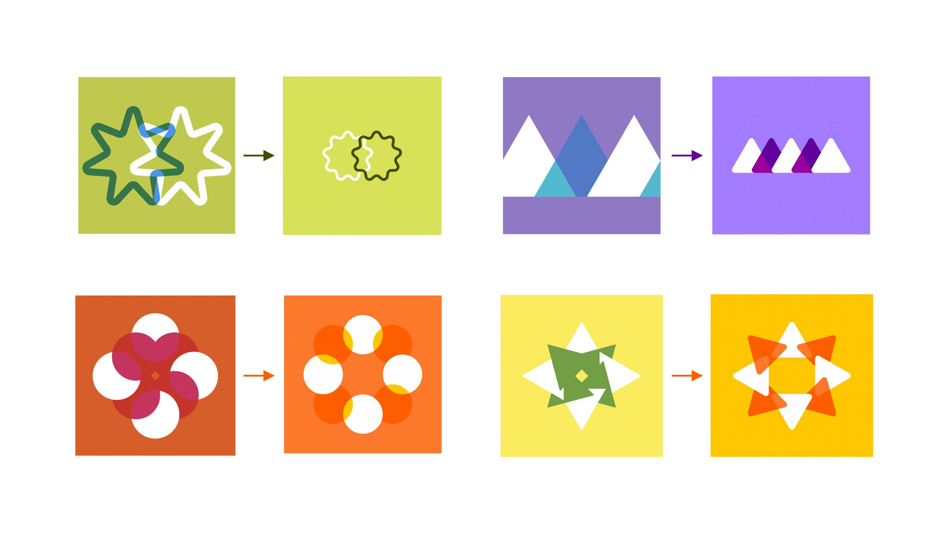
Just say we had the title: ‘Flexible Visual Systems’. This gives us 23 letters, 7 vowels, and 16 non-vowels (that is, consonants and spaces). Let’s use one of these numbers to help us pick the shape. We have 9 shapes to pick from. We can use the letters to pick this. We divide the number of letters (23) by the number of shapes (9) and take the remainder, using what is called a modulus symbol. A modulus symbol in programming looks like a percentage sign and returns the remainder when one integer is divided by another. In this case, our equation ‘23 % 9’ will find how many times 9 goes into 23 (twice) and return the remainder (5). This means we pick the fifth option for shape … that’s a hexagon.
Merging the designer and developer
We built a digital tool specifically to help the SRB team understand how their titles are generating their respective unique images and to allow them to export these designs for use in platforms outside the website. There is not a project that goes by where we don’t build a digital tool. We love them more than anything.
Building a tool doesn’t just help at the end of the process to showcase the system you have designed. We built the tool very early on to help stress-test the system. The designer still has to make sure each application of the tool is ‘good’. They are creating boundaries that help narrow the possible outputs in order to create consistency. This involves seeing the outputs as you are designing. You need to have access to many images that will change as you tweak the boundaries. You can’t do that using traditional design tools – you can’t test out every combination without completely blowing a client’s budget. You need to use programming to design the system.
In our industry, it has been rare to use programming directly in designing. Generally the two disciplines are seen as very distinct parts of the digital design process, and thus left to be attacked by two different sets of professionals. Designers handle all the creative thinking and visual expression, developers all the implementation. As industry professionals, we have it in our heads that these require two very separate parts of the brain, or even two very different brains. This attitude seems to be changing slightly. There are now schools of developers with design backgrounds who are throwing themselves into the visual expression part of the process, rather than hiding in the implementation part. And there are schools of designers who are experimenting with programming their own tools and using programming concepts to turbo-charge their designs. While not a new term, ‘creative coding’ is now popping up in many more job descriptions and much more of the design literature.
The process used in this project, and described here, is a great example of blurring the line between design and development. The designer and developer had to work in unison. At Public Websites, we see this as an important part in the future of our industry.
This is especially so as project budgets seem to be shrinking at a rapid rate. Studios are disappearing. AI is proving, much to the dismay of our industry, that our unique and original aesthetic decisions are maybe more standardised than we ever cared to admit. It is a very confronting scenario.
Can we figure out some way for the studio to maintain a competitive advantage over a code- and image-generating chatbot?
The answer, we believe, is ‘Yes, we can’, but we must change our process. At the moment, designing systems and using programming concepts in our design process feel like our best shot. It is a way for us to deliver quality design at scale with a small team. Being forced to design more for less always leads to very creative design solutions. The process I have described above is an example of this. We are being kept to account, and I think that is a good thing for our industry. It certainly is for our clients.
Two more things
Before I sign off, I wanted to mention two other exciting things about the site.
Firstly, I wanted to highlight how great the use of a headless CMS is for the archive. A headless CMS is one that is ‘decoupled’ from the front-end of the site (the interface that users see). There are many benefits to this decoupling, and headless CMSs are known for their scalability, flexibility, and ease of use. We used Prismic for this project. It is a very popular CMS, one tried and tested on the majority of our projects (including the SRB’s newsletter series, The Circular). This choice will improve the editing experience for the SRB team, freeing up their time to focus on commissioning work. It will also future-proof the archive, ensuring it is using the most up-to-date tech stack.
The second thing to highlight is the adoption of Algolia to turn the archive into a search index. This has been put to great use in the new site and makes for a fast and responsive user experience for the SRB readers. It will also open up future opportunities for the archive to be used in research projects and for purposes we can’t anticipate. We have already adapted the search index to create efficiency tools for the team’s internal use, but if readers have further ideas on what they might like to do with this new feature of the archive, then we would love to hear it.